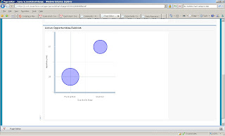
Today is my last day of training so I thought I'd try to build another chart capitalizing on some of the harder pre-work that was done yesterday. I'd like to try my hand at a radar chart sometime but with the time allotted, I took on the bubble chart. Here is the finished product. Similar to the bar chart, this chart is embedded in a vf page which passes to the Flex object the session id and the account id.
It has 3 data components per record:
X: StageName
Y: Probability
Radius: Amount
The chart could be useful for salesforce users to surface high value opportunities for a given account.
Lessons Learned:
I had this weird effect where my entire data area was plotted as orange. When hovering over the orange, I could see my two records and the related X, Y, and R attributes. I suspect that this was because my data elements had different data types. Only when I removed StageName from the plotted data did the orange block go away. The only thing that could resolve it was to create tags in my chart for the Horizontal and Vertical axis. Within these tags, I specified the category fields as StageName and Probability. Only after adding these tags did my bubbles plot as above. Here's the relevant section from the mxml:
<mx:BubbleChart
id="mybubblechart"
showDataTips="true"
>
<mx:horizontalAxis>
<mx:CategoryAxis title="Opportunity Stage" categoryField="StageName" dataProvider="{opps}"/>
</mx:horizontalAxis>
<mx:verticalAxis>
<mx:CategoryAxis title="User Probability" categoryField="User_Probability__c" dataProvider="{opps}"/>
</mx:verticalAxis>
<mx:series>
<mx:BubbleSeries
xField="StageName"
yField="User_Probability__c"
radiusField="Amount_Num__c"
fill="{sc1}"
stroke="{stroke1}"
dataProvider="{opps}"/>
</mx:series>
</mx:BubbleChart>
I think that there will need to be a good amount of data massaging done within salesforce for the data to be presented in some interesting ways. For now, this gives some perspective on LOE and feasibility.

No comments:
Post a Comment